You know those homes you gawk at as you walk down the street, or the ones you can see into by way of their large front windows, peeking at the dreamy interiors? Well, home tours give us the chance to go peering through them without having to barge in the front door – or even leave the house. This mid century modern home was thoughtfully designed by the talented Caitlin Murray of Black Lacquer Design. And boy! Is it something! We virtually sat down with the designer to chat about the style, art, accessories, and colors that adorn the mid century home. It’s interesting, fun, and totally gawk-worthy. So, enjoy! And then go check out more of Black Lacquer Design by way of Caitlin’s very own chic bold home!
What was the inspiration for this home’s design?
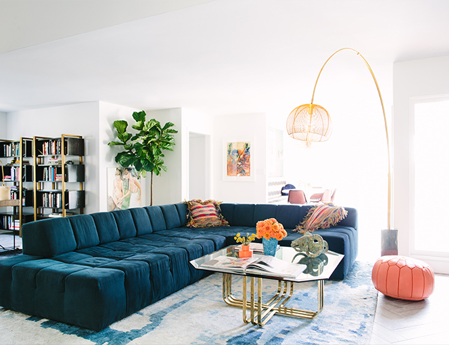
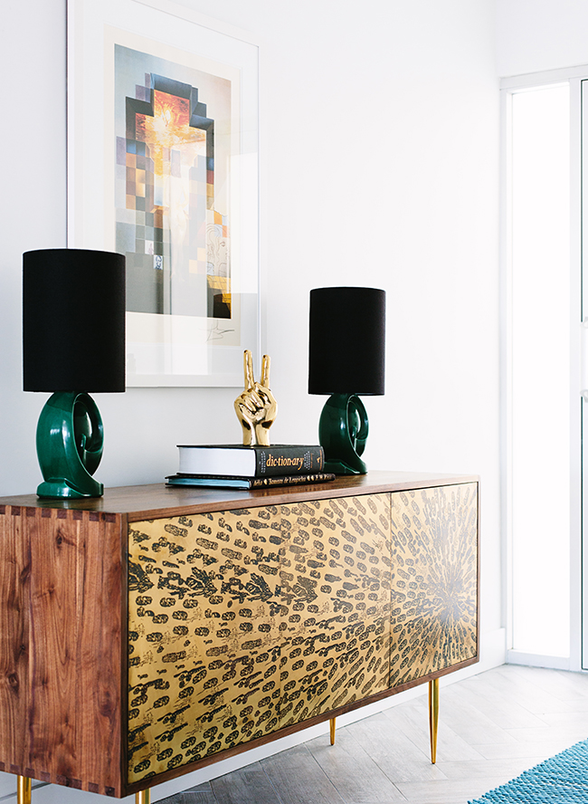
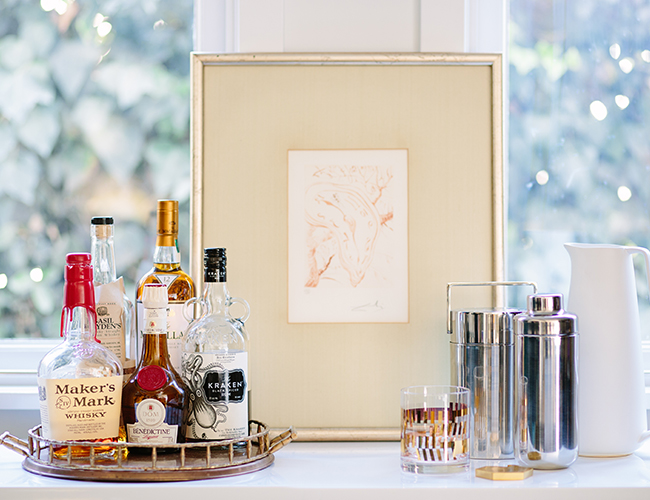
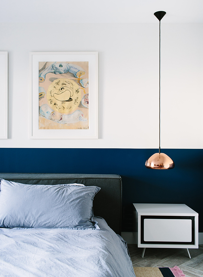
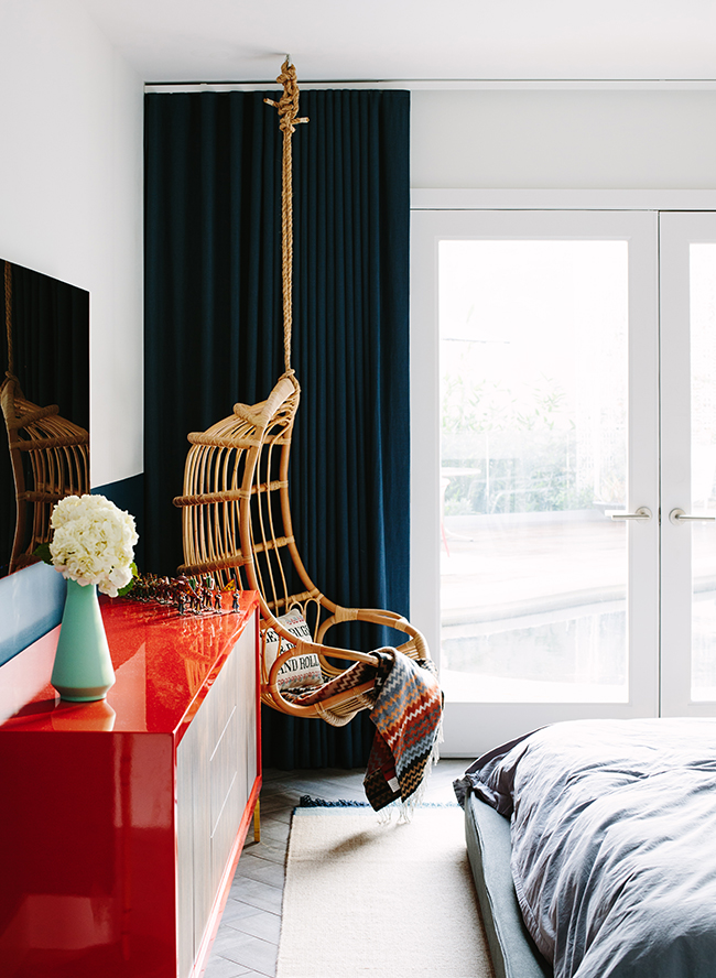
The inspiration for this mid century modern home was both the setting and the client’s impressive art collection. Nestled in the Hollywood Hills with a gorgeous view and very California indoor/outdoor vibe, complete with a pool and vast sliding doors, I wanted to play up the greens and blues of nature and work in the vibrant, saturated hues of his original Salvador Dali prints.

Tell us a little bit about the history of the mid century modern home! How did you stay true to that while decorating?
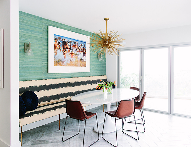
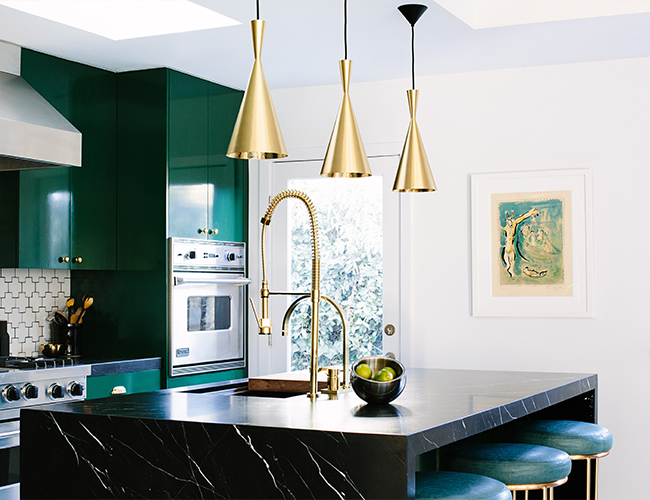
The house was built in 1949 and has the very clean, modern lines that are the mark of mid-century architecture. By the time I got my hands on it, the home hadn’t been updated in at least twenty years and was stuck in an awkward in-between of eras and styles. I wanted to revive the space while staying true to the bones and honoring the contemporary nature. I think that opening the floor plan while adding pops of color and an eclectic mix of furniture made things feel both soulful and fresh.
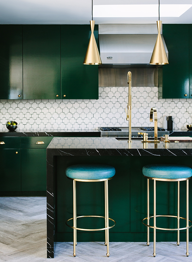
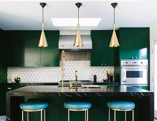
We love the statement making tile work and bold color in these spaces! Is that a common thread in your work? When designing a room, where do you start?
I like to approach each room like I’m painting an abstract piece of art. I consider principals of design like scale, emphasis, space, texture, and color theory and curate pieces that all work together to tell one artfully balanced and harmonious visual story.
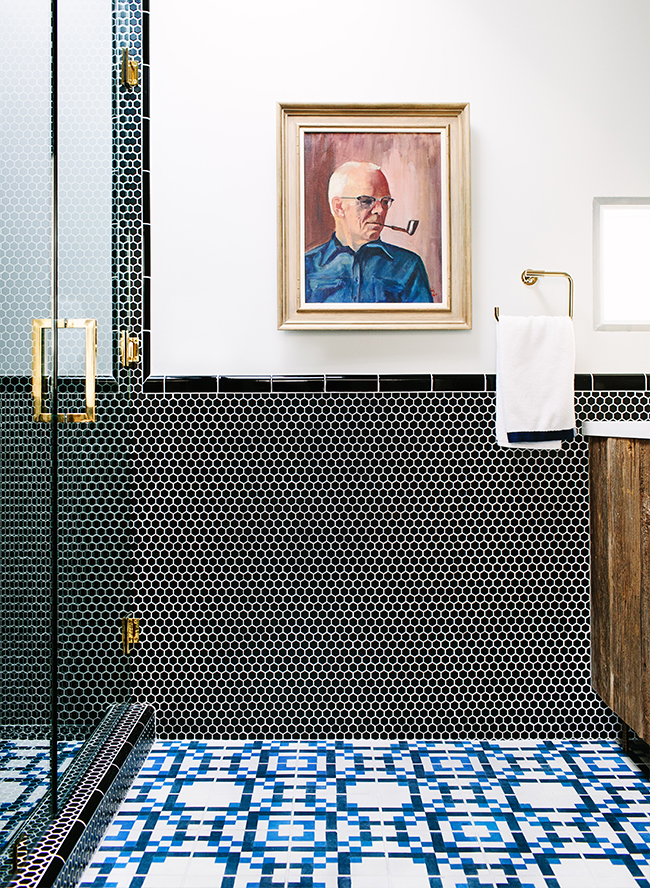
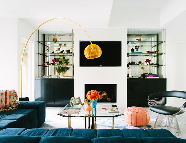
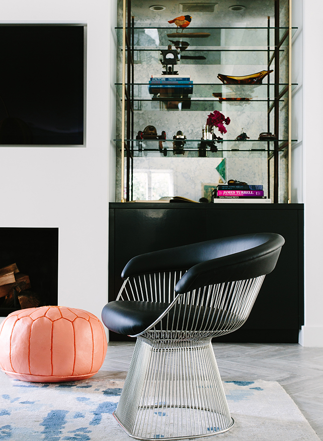
What is your best advice for incorporating color into a room?
Choose a palette you love based off of a favorite wallpaper, fabric or painting—then use that combination as a basis for choosing each item you incorporate. If you don’t feel confident about your color pairing skills, this is a fool proof way to build a space that works (and is already approved by a professional)!
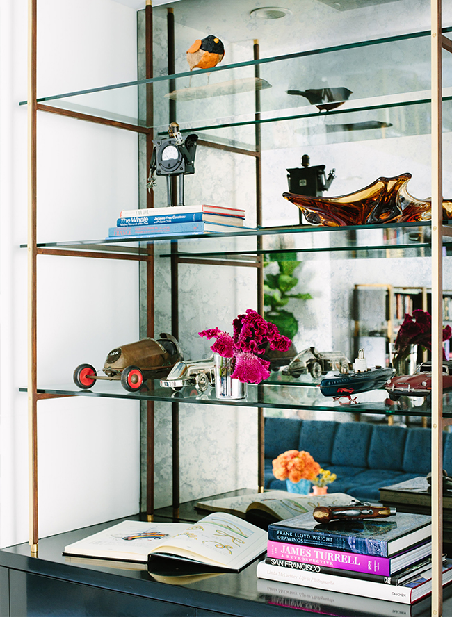
What are some of your favorite pieces in the home and how did you discover them?
I love the funky vintage brass coffee table that I scored when on a bit of a flea market binge. A lot of the other pieces, including the banquette and living room shelves, are custom and were made with a lot of love (and many revisions!).
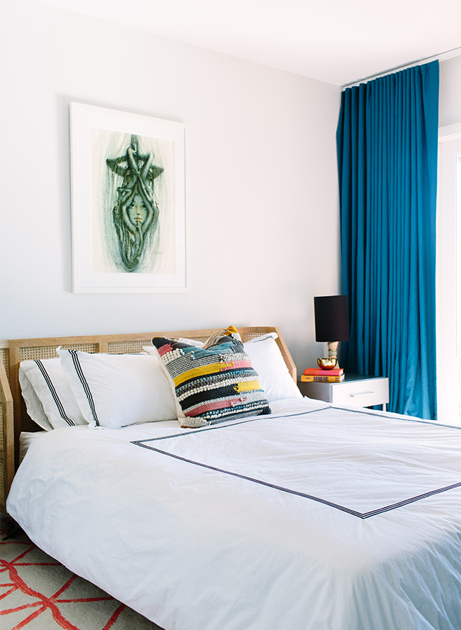
What was the biggest challenge or project you took when designing the space?
The space was limited on square footage, but we wanted to pack in a lot of function specific to the client’s needs. I think the trickiest thing was deciding which walls and features would stay and go. In this process, we opened up the main area floor plan a ton, took out the kitchen wall, demolished a wet bar and removed an entire powder room (which is obviously a big no-no when it comes to resale but needed to happen!).
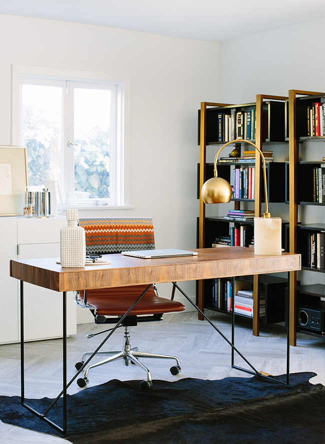
Do you have a favorite room in the house and why?
I’m partial to the master bathroom and the kitchen. I designed them in a matter of minutes, one after the other, and the client said yes to every single design, material and fixture choice. They serve as a bit of a showcase for me since because of this, those spaces became complete, uninterrupted art. That feels completely fulfilling.
What is your favorite thing about this mid century modern home?

