We’ve known Kelli Lamb of Rue Magazine for quite a while now, thanks to industry events and socials, so we thought it time to sit down for an interview and rack her savvy brain! The Managing Editor at Rue is not only sharing a bit about how she landed her coveted role, but also, letting us step inside the L.A. pad she shares with her husband. The design is contemporary, cool, and totally relaxing – necessary for someone who works from home (more on that later). So grab your cup of coffee and be inspired by both Kelli’s living space and super cool day job.
Tell us a little bit about your career path, have you always wanted to be a writer?
I always really enjoyed writing. I remember taking a few creative writing courses each summer and realizing that storytelling came natural to me. In college, I studied Sociology, which involved a lot of research and writing lengthy research papers. At first, I didn’t think I was using my degree at all, but today it’s obvious that the two writing types – creative and data-driven – are exactly what I do at Rue!
We love Rue and your fresh and modern content! What are some of your favorite topics to cover?
Thank you! I really love how the Internet and social media have made well-designed interiors so accessible and approachable. I love that people are willing to open up their doors and share their space – it’s such an intimate thing. When a space – whether it be a home or a shop or a workspace – is also able to share someone’s story, this is when I’m happiest.

What do you look for in a pitch or new story concept?
First, I think it’s really important that it hasn’t been covered 100 times already. I get really frustrated when I’m on social media and see the SAME feature on many of my favorite accounts. I am an editor, yes, but I also got into this industry because I really enjoy reading blogs and lifestyle sites. So when something is shared on all of the top sites, it loses its charm. If someone is pitching a story (a home or office that has already been featured elsewhere), it’s important to show it in a new light.
A pitch should have that story idea front and center – maybe it will be a profile piece on the owner in the space, as opposed to another tour. Second, and this one is a little tough, but I ask myself: “Does this look like Rue?” The images might be really beautiful. I might even be obsessed with them! But if it’s not a natural fit with our aesthetic, we have to pass. This is beneficial for both parties – we want people who are getting published to have their work shown to the best possible audience. If it’s not a match with what we usually share, then our readers might not click on it.
It seems like you’ve totally found your niche! What would be your advice to young women who are trying to figure theirs out?
Oh boy. I think it’s important to try everything out. Say yes to opportunities, introduce yourself and network as much as possible – you never know when assisting on a photo shoot or going to a local event will introduce you to your next boss. By experiencing every facet of an industry you’re interested in, you’re able to identify which pieces of it you love the most, and which might not be a great fit for you. (For example, I dabbled in styling a few years ago. While I’m not bad at it, I don’t love it. It’s better to use my time to write!)
We’ve heard both pros and cons to working from home – how do you stay focused and motivated?
I have to have a clean space to stay focused, so I straighten up the house every night before I go to bed. I also use a planner (The Day Designer) to categorize my tasks for the day. (It has a spot for the TOP 3 which is key!!)
It’s definitely an inspiring spot to work! What was the inspiration for this room?
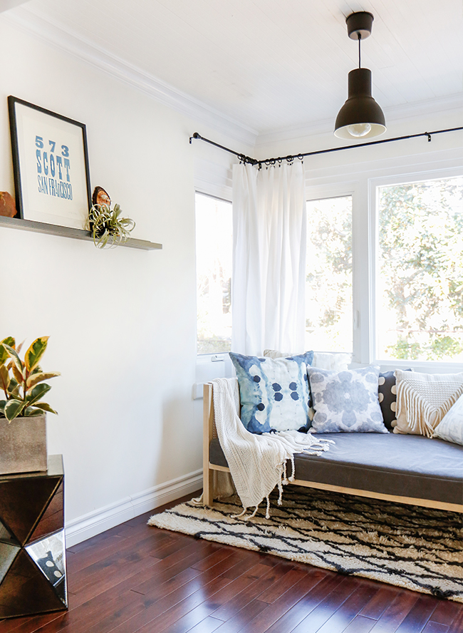
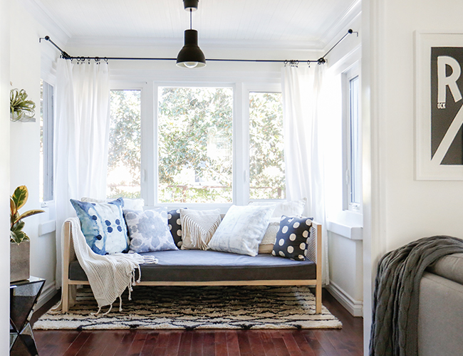
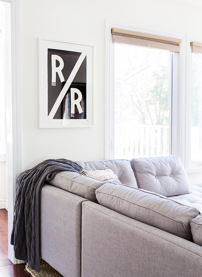
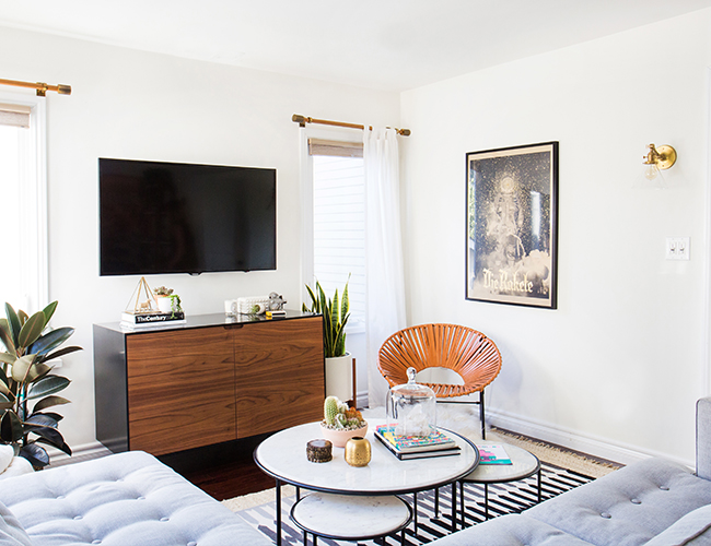
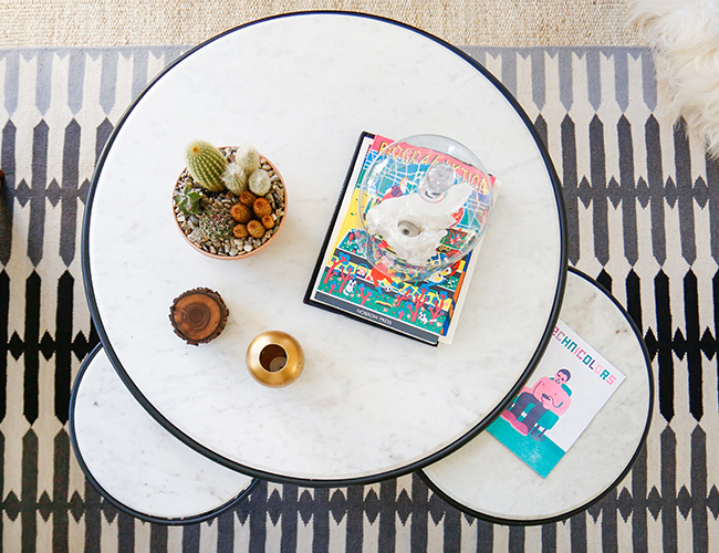
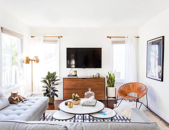
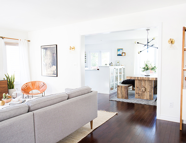
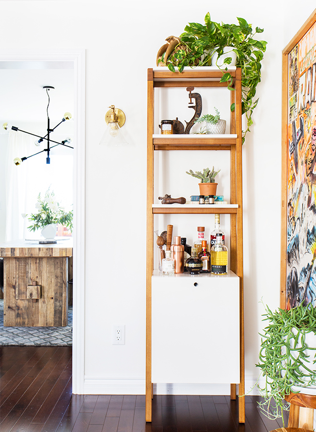
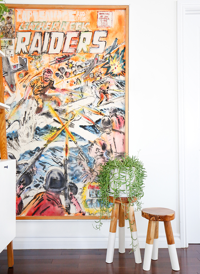
Thank you! For my living room design, I worked with Haley Weidenbaum of Homepolish LA. I had just moved from San Francisco – we lived in a charming and very old Victorian-style apartment – and I was looking for something that would be visually restful. I didn’t want a lot of crazy colors. Moving to Los Angeles was a big change for us, so the top priority was making the home a place we WANTED to spend our time in, just in case we didn’t want to spend our time in the city itself. In the dining room, we wanted a huge table. I prefer to work there instead of my office (which is a spare bedroom), because it’s so sunny, I can see the front yard and the back deck, and it’s closer to the coffee.

Where do you love to shop for home decor?
I am pretty loyal to brands like West Elm and Target – I am grateful that cool design is available at affordable prices, and I think it’s really powerful that so many people can access it. I also adore Serena & Lily – though they’re more traditional, their furniture can really blend with a lot of aesthetics. However, I also like to look to smaller, independent brands like The Citizenry. They’re setting trends with a lot of their pieces! For rugs and textiles, I think there are a lot of cool artists out there – Kerri Rosenthal, Rebecca Atwood, and Aelfie. This is a great way to bring your own personality to a home while still getting the big pieces from ‘big box’ stores.
Oh, and look to spots like Lamps Plus – you can always find big name brands like Arteriors for a great price!! It all goes back to that whole, “Internet making quality design accessible” thing!
Coffee Order: Black coffee – no cream or sugar here!
At the top of My Travel List: Ireland!
Favorite L.A. Restaurant: Too many to list! I like to stick around my neighborhood, so Malo, Little Dom’s, Kettle Black, and Black Cat are where you’ll usually find me.


Love her style!
the prettiest!
Gorgeous!
Love her home tour, thanks for sharing!
Obsessed – It’s so cute!
Such a gorgeous, airy space with lots of prints & textures – oh and my favorite, pops of green!
Thank you so much for sharing my space!