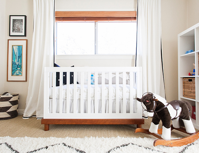
Those eyes! We must first acknowledge how beautiful this little baby boy is!! .. and I mean his nursery is pretty amazing too! This black, white, and gold nursery is fit for a prince – so modern and chic and yet so fun and baby proof – how do they do that?! Our fave chic things include the leopard chair (this needs to make its way into our office!) and that shiny gold toy chest, but then there’s little Luke’s hot air balloon sheets and the rocking horse of course! Yep, Erin Williamson thought of everything. So here’s how the momma and design extraordinaire came up with it:
What was the design inspiration for this room?
I knew I wanted to take advantage of the great light in Luke’s room by doing something bright. I decided neutral and textured would be a sophisticated yet versatile place to begin. When I found a Raoul Dufy screenprint at a local vintage shop the rest of the room came together. Arty graphics and primary accents to stimulate growing baby eyes finished the room out.
What is your favorite piece in the room?
I found so many great things second hand — the chandelier, drummer boy painting, and brass chest to name just a few. This left room in my budget to splurge on a commitment piece, so I had a vintage Milo Baughman swivel chair reupholstered in Premier Prints’ Togo fabric. I think it adds an extra layer of fun, and it even passes the comfort test.
What’s your best advice for designing a nursery that’s not cheesy?
A nursery is an extension of your house, so it’s nice to incorporate things that would also make sense in the rest of your home. Make it a space you will want to spend time in. That said, it’s still a kid’s room and it’s important to throw in something wacky or unexpected, something that appeals to younger sensibilities.
Any cool stories behind the pieces in this room?
Almost everything in here has a story, because I am an obsessive collector. I love vintage, and I love for every room to have a sense of history and patina. Probably the nursery’s centerpiece is the Drummer Boy painting, which I found hidden in a dusty corner at the Round Top antiques fair. It anchored Luke’s older brother’s room for years until we moved, and then it found a new home in the nursery. It’s important to share, right?
Tell us about you! Your interior design background, the sweet little baby that sleeps in this room, blog, etc!
I’m a photographer by training, so I’ve always been visually oriented. Over the course of several moves and subsequent decorating adventures, I found that I really enjoyed putting together rooms that create a vibe. When we moved to Austin to family plan almost eight years ago, I started a design blog to keep myself occupied. Design Crisis was born, and my eldest son was born a couple of years later. Over the years I’ve documented many personal decorating projects, and now I have transitioned into helping other people make beautiful spaces. All the while, my little guys have kept me very busy. Luke is almost two now, and he’s in full on meddle mode. He always has a smile on his face, especially when he’s pulling every toy off the shelf and tossing it onto the floor. I wouldn’t have it any other way.


I am loving the black and white nursery trend! It is way too cute and the baby is even cuter!!!
I mean that baby…. Can we be roommates?!
Love this nursery! It will transition is well with Luke as he ages! The air ballon bedding, I mean!!
Need that trunk and chair in my life!! So adorable for any age!
What a cute little nugget! Love this nursery!
Thanks for stopping by!
Right!? We want it in our room too!
Totally agree Thanks for reading Jana! xo
Seriouslyyyyyyyyyyyy
We are too! So fun for gender neutral rooms!
Obsessed with this nursery!.. will probably model my own room after it
Haha we’re all going to have rooms inspired by a nursery
Would it be possible to share where the awesome sauce rug is from and if it’s worthy of baby snuggle fests?