With the rise of vintage furniture and the show Fixer Upper, ‘farmhouse’ has become a coveted interior style. And this Modern Farmhouse home tour on our lifestyle blog today does right by it. Designers Leigh & Aly of Pure Salt Interiors (read their story here!) took that style, a few of the family’s own vintage treasures, and ran with it. The result is the super cozy, slightly rustic, and totally beautiful home seen here!
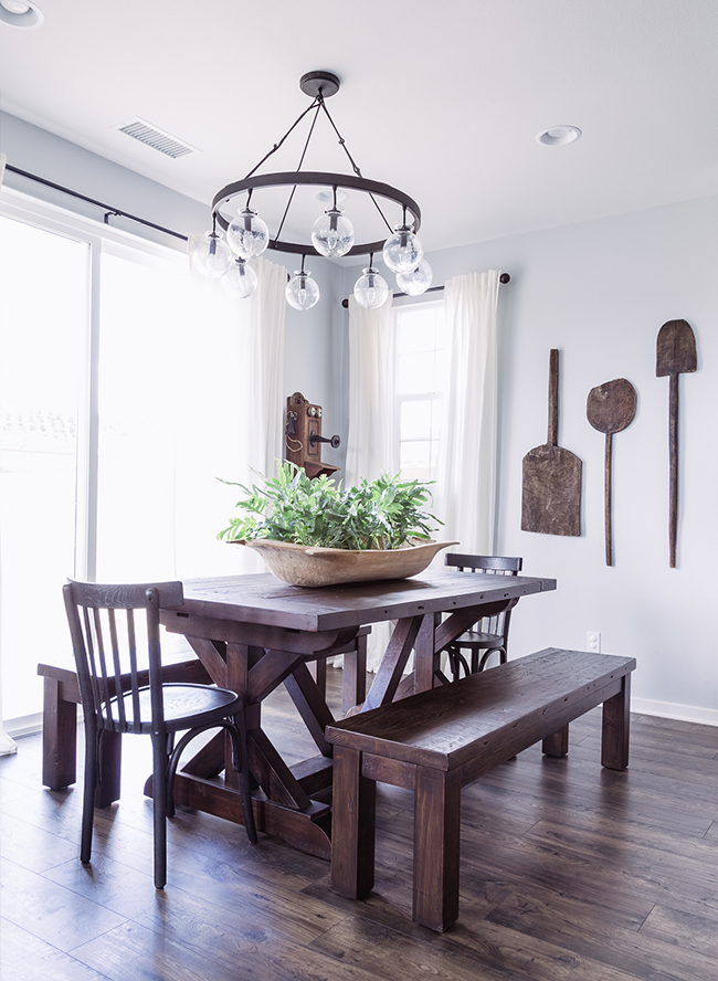
We had so much fun designing this space. Our clients love the farmhouse look and their main request was to make the space practical, functional and comfortable for their young family. The inspiration for this room was an old vintage phone our clients received as a wedding gift years ago. The phone had been in storage and when they came to us they asked if we could find a space for it. Of course our eyes grew wide with excitement! We love vintage finds and especially when they have meaning. Since wood is one of the most popular materials in farmhouse design we decided to use this as inspiration for the rest of the wood tones to give the space warmth and charm.
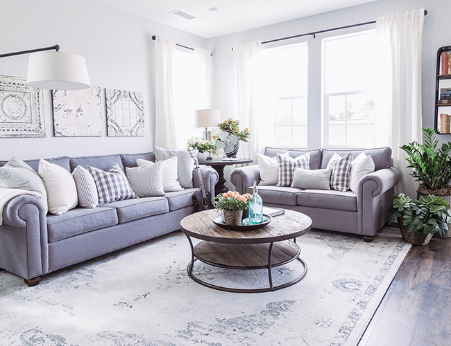
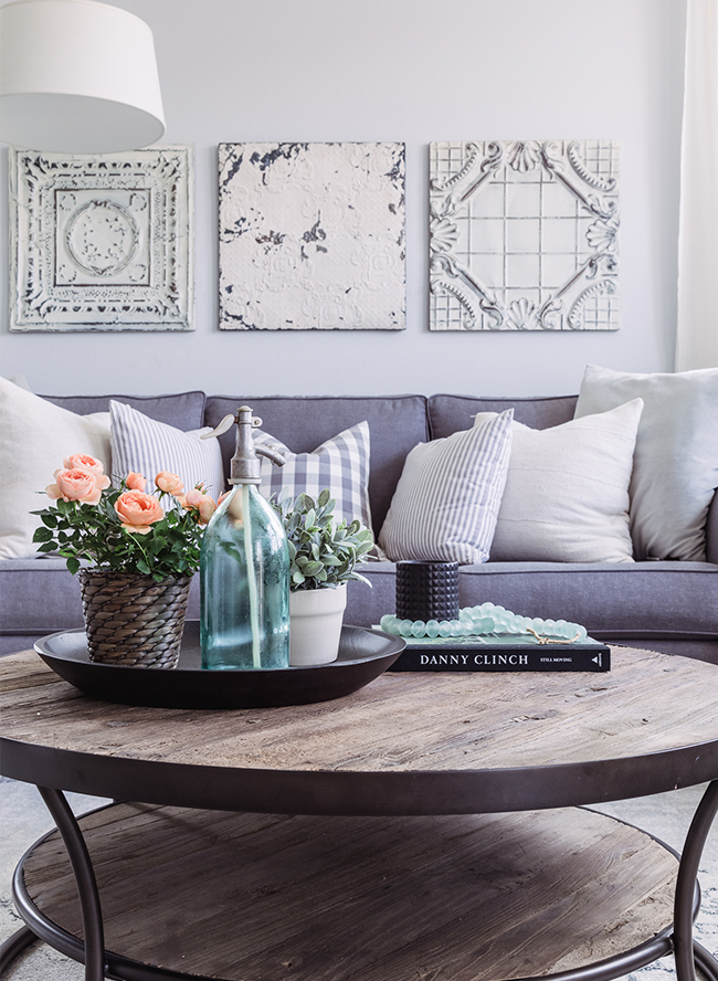
The family room was built around the blue, grey and sea-foam green tones from the other rooms and the vintage rug that our client fell in love with at first sight. We custom made the couches to perfectly fit the space and maximize seating. We used a sunbrella fabric for this young family since we truly believe fabrics should be both beautiful and functional! Additionally, we added some found pieces on the walls to give the room the same character found in the dining room and kitchen. Our favorite pop of color is the vintage book shelf separating the living and dining room. What really finished off this space was the life we brought in with the fiddle leaf fig and other plants sprinkled throughout the space.

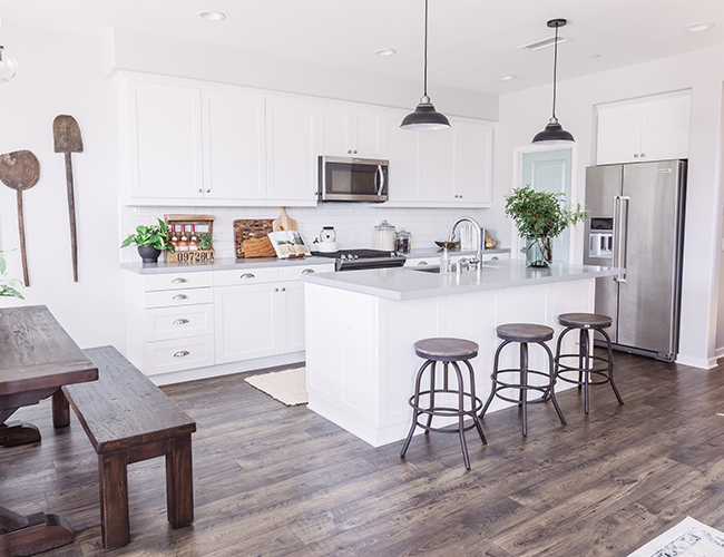
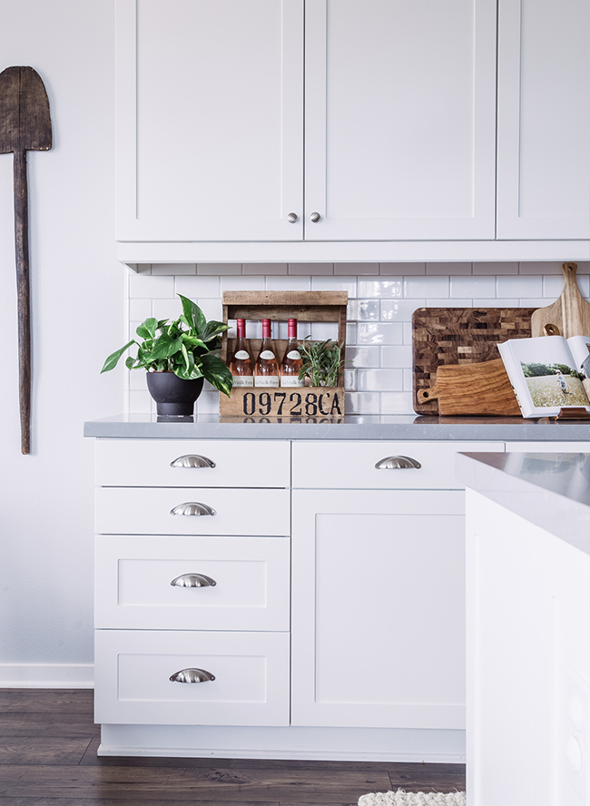
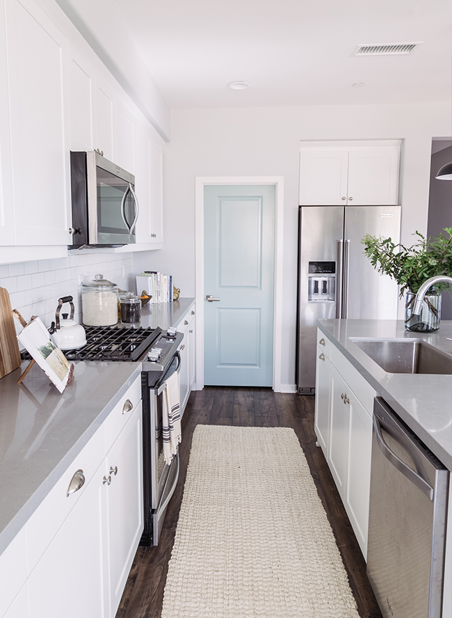
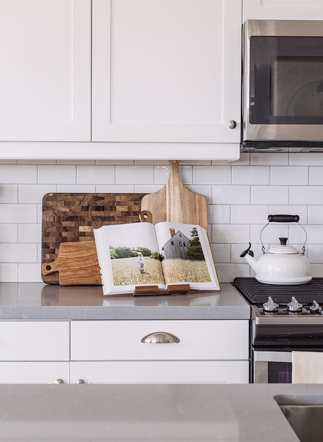
Since the kitchen is the heart of a farmhouse home, we wanted this room to feel spacious, comfortable and unpretentious. We also wanted it to work seamlessly with the rest of this space. We used a classic subway tile paired with white shaker cabinets to feel light, bright and airy. To keep it from being too stark, we also added some texture with a gray quartzite counter and a pop of color with a sea-foam green door.


Obsessed with that kitchen!
ummm yes please
Dream house!!
love the colors!