Get ready to be greeted by bright whites, soft blues, and some pretty beautiful rooms on our lifestyle blog today with this traditional style Texas home! Brittany Jones not only has an incredible eye when it comes to photography, but apparently interior design as well! She designed and decorated her stunning home from floor to ceiling – and she did an incredible job.
How would you describe your design aesthetic?
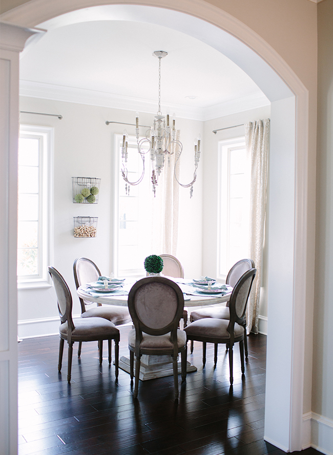
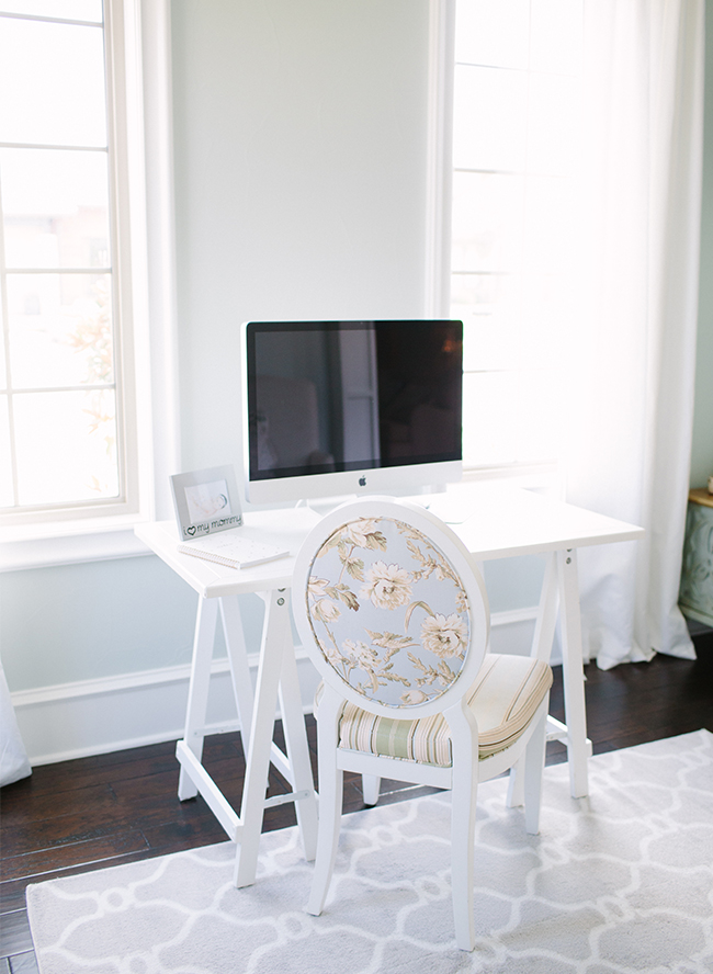
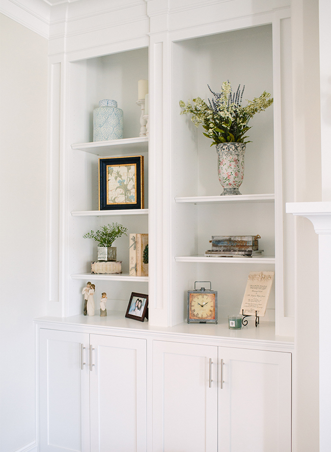
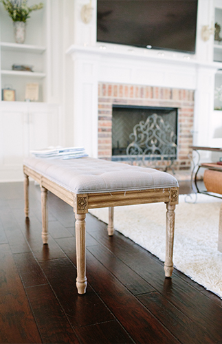
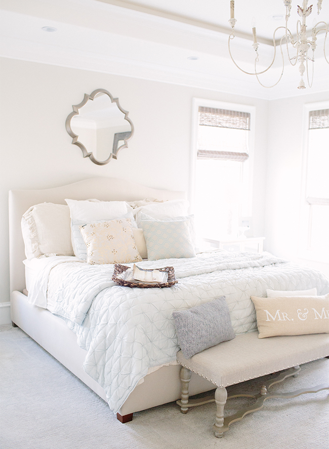
I would say my design style tends to air on the traditional side, but with a little bit of modern flair. I love airy, soft, and peaceful design, and I wanted our home to immerse you in comfort and relaxation from the second you walk in the door. From its soothing colors to the crisp white, and window light, you just cant help but feel happy in this home! From a decorating standpoint I love pieces with character and old world charm. I think they make a home feel comfortable and well loved.
You completely designed your home from the ground up! What were your major sources of inspiration?
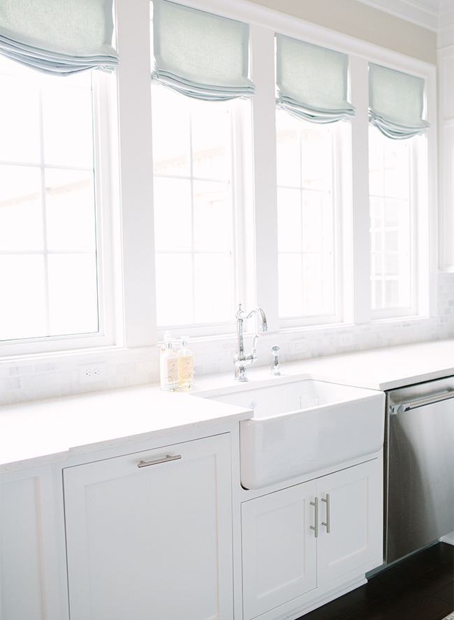
For the building process, my biggest source of inspiration came from the beauty of natural light. I knew I wanted a home with TONS of natural light streaming through all day so we planned accordingly. Every room is filled with tons of light! The kitchen windows are what drove the entire design and we designed the rest of the floor plan and home around the plan for those windows. I’ll be honest and say I don’t know where my design inspiration comes from… I just enjoy decorating and love hunting for the perfect pieces. I tend to go with the mindset of “when you know, you know”. It will feel right to you when you find the perfect piece.
Tell us about the renovation process, were there some hiccups along the way?
Yes, there were a few… But, I am a strange one and actually LOVED the entire process of building a home— hiccups and all! Let’s see… First off they staked the house out BACKWARDS!! As in, had the back of the house facing the street— luckily I was on site before they poured the concrete! LOL. Another hiccup that we didn’t realize until after we moved in was the mistake of doing white grout on the floor. Don’t ever, I repeat, DONT EVER think this is a good idea in west texas where 50 mph winds and blowing dirt is a common occurrence. After having the grout ripped out and redone twice in less than 1 year and it still looking awful, we decided to rip the entire floor out and put in the lovely brick flooring you see in the utility room. Much better choice. Now we are in the process of redoing the bathroom tile too! Live and learn, right?
When decorating a home from top to bottom, what should you save on and what’s worth the splurge?
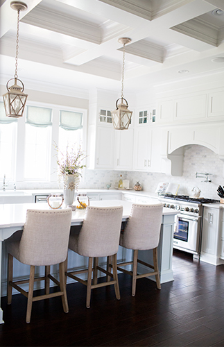
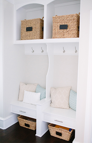
DECORATING: When decorating a home top to bottom I would splurge on your main furniture pieces— couch, barstools, chairs, table, bed, etc. Get the good stuff there and then you can accent with cheaper items such as vases, lamps, baskets etc. So many of my decor items are from random cheap stores around town!
BUILDING: I would splurge on your dream countertop material because it covers so much surface, and it is something you see everyday!! I cant imagine having a huge island made with a material I wasn’t totally obsessed with. I would also splurge on the woodwork— I think what gives our home such a “wow factor” is all the trim work. I mean look at that coffered ceiling in the kitchen!!! It is truly breathtaking. Fantastic crown molding, custom cabinets, and beautiful baseboards are well worth the money. I would save on cabinet hardware— you can find great options at affordable prices if you look around. Also, door knobs… I originally picked out super expensive doorknobs and thought they were so important. We ended up going with the cheap basic egg shape knobs and I never even notice them. Glad I didn’t waste my money on them!
We love how bright and clean your home is, do you have a favorite place to unwind?
My favorite place to unwind my kitchen nook. I enjoy cozying up with a glass of wine, Miles Davis playing in the background and my husband cooking a delicious dinner… I provide the great conversation so I’m not totally worthless 

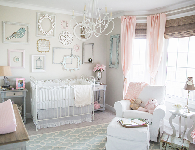
Your nursery is stunning! Was there specific inspiration for each room, or was a cohesive feel important to you?
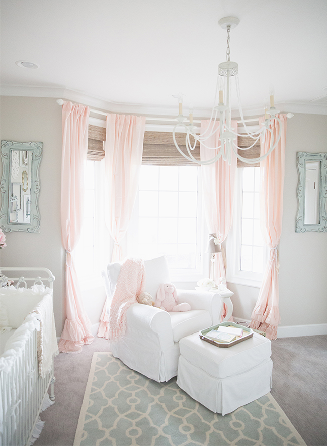
I really wanted a cohesive feel to the entire house, aside from the nursery. One thing I love about having a house with a cohesive design is that I can move decor from room to room when I get tired of it. Since it all goes together I can mix and match and try out new things in different places! It keeps it fun and interesting that way! The nursery is the only room that brings in another color besides tan, gray, white and blue. I added the pink because I just couldn’t help myself— every little girl must have pink, right?!?!












WOW I need to live in this house!
This kitchen is absolutely amazing!!
This home is breathtaking! Such a beautiful design
Loving all of the bright white details!
so fresh and modern – while still maintaining the traditional look!
we would LOVE to move in
we’re basically obsessed!
We’d like to as well
wow, that kitchen <3333
That nursery is adorable! The perfect design!
Brittany, what type of countertops and the color name did you use in the kitchen. The entire room is sensational.
Where are those curtains from in ther nursery- I love them!